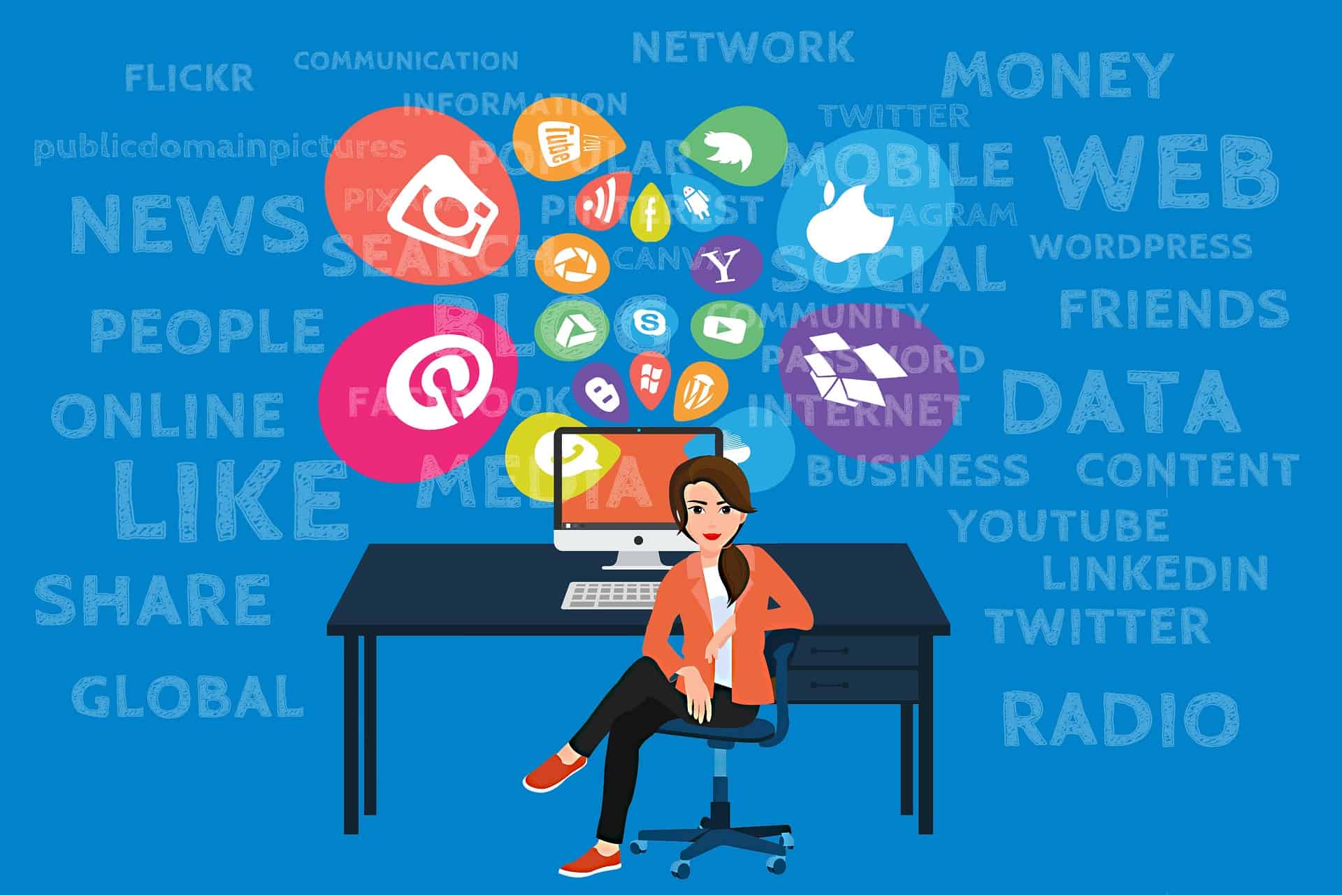
Social Media Strategy

Social Media Strategy

Create a successful social media strategy to boost your internet presence. Our expert suggestions and best practices will captivate your audience and increase website traffic. Having a social media strategy is vital to the success of your small business, especially in regards to how much benefit you will receive from your online presence.

Merely having a website is not enough, as many small businesses have learned, the hard way. Many businesses are under the mistaken impression that having a website will lead to new clients or customers, but a website is only part of the puzzle. To compete in the market you need to have a presence on sites like Twitter, Facebook, Instagram, Pinterest, and YouTube.


Create Accounts on Top Social Media Networks

Create Accounts on Top Social Media Networks

YOU Can Create and Implement a Social Media Plan on a Budget

As a website designer with over two decades of experience, I know firsthand the power of a bold and creative social media strategy. I know a thing or two about making a splash without breaking the bank. Let me tell you, small business owners, you can do this!

Determine the Target Audience of Your Social Media Strategy

First things first, to a successful social media strategy you will need to figure out who your target audience is and where they’re hanging out online. No sense in posting about your latest artisanal pickles on TikTok if your audience is all about LinkedIn, ya know?

The key to success in reaching your intended audience online is to first understand who they are and then discover where they congregate. Learning about their background, hobbies, and habits is essential. Insights like these can be gleaned from the results of online surveys, mentions on social media, and analysis of website traffic data.

  • Know your demographics: age, gender, location, etc.
  • Analyze website traffic data: use tools like Google Analytics to see where your traffic is coming from and what pages are most popular.
  • Conduct surveys: ask your current customers and target audience directly about their interests and behaviors.
  • Supercharge Your Social Media Strategy with WordPress Plugins: Supercharging your social media strategy becomes effortlessly achievable when you tap into the remarkable potential of WordPress plugins, empowering you to optimize content distribution, engage with your audience, analyze data, and enhance your social media presence with remarkable ease and efficiency.
  • Monitor social media mentions: track what people are saying about your brand and industry on social media platforms.
  • Look at your competition: see where they’re active online and who they’re engaging with.
Creating Social Media Content

Creating Social Media Content

Social Media Content

Next up, let’s talk content. You don’t need a fancy camera or professional editing skills to make your stuff look good. Your smartphone and a basic editing app can do wonders. So, show off your products or services in the best light and make ’em look irresistible!

Tips for Creating Social Media Content

The key to successfully reaching and connecting with your target audience on social media is to create content that is both interesting and useful to them. Maintaining coherence in your brand’s voice, tone, and messaging throughout your content is essential, as is taking into account the platform you’re posting on and the best practices for that platform. When making posts for social media, keep these things in mind:

  • Know your brand voice, tone, and messaging: keep this consistent in all of your social media posts.
  • Consider the platform: each platform has its own unique audience and format, so tailor your content accordingly.
  • Utilize visually appealing content: use images, videos, graphics, and other types of media to make your content stand out.
  • Encourage engagement: ask questions, share polls, and create conversation starters to encourage engagement from your followers.
  • Experiment with different formats: try out new types of content and see what resonates best with your audience.

Collaboration With a Social Media Influencer

Collaboration With a Social Media Influencer

Collaborate With Social Media Influencers

Collaboration is an essential part of any successful social media strategy, folks! Partner with other small businesses or influencers in your industry for cross-promotion love. It’s a win-win situation, trust me.

You increase your brand’s visibility and credibility when you collaborate with influential people on social media. Choosing influencers who share your brand’s values and messaging and having a clear understanding of your objectives, budget, and desired outcomes are essential before beginning to work with influencers. Keeping the following in mind when collaborating with social media influencers is essential.

  • Define your goals: what do you hope to achieve through collaboration with an influencer?
  • Research and choose your influencer: look for influencers who align with your brand values, have an engaged following, and produce high-quality content.
  • Negotiate terms: decide on compensation, post frequency, and other collaboration details.
  • Set clear expectations: You and the influencer should clearly understand the expectations and responsibilities of the collaboration.
  • Measure and evaluate results: track your campaign’s performance and use the data to evaluate its success and make improvements for future collaborations.
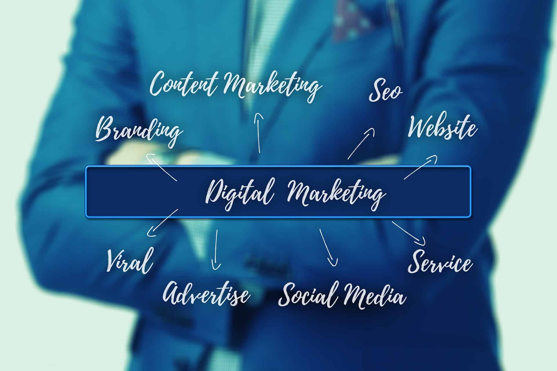
Social Media Advertising Campaigns

Social Media Advertising Campaigns

Advertising

Finally, let’s talk about advertising. You don’t have to spend a fortune on ads to get the word out there. Platforms like Facebook and Instagram have budget-friendly options to help you reach your specific audience and drive traffic to your website.

Social media advertising can reach and engage a significant and targeted audience. It’s essential to thoroughly understand your target market before launching a social media advertising campaign. You should also look into and make use of the best advertising options each platform has to offer. When creating your social media advertising strategy, bear the following essential considerations in mind:

  • Know your target audience: understanding demographics, interests, behaviors, and more will help you to effectively target your ads.
  • Utilize multiple ad formats: each platform offers a range of ad formats, so experiment with a few to see what works best for your brand.
  • Set clear goals and KPIs: define what you hope to achieve through your advertising campaigns and track your progress towards these goals.
  • Continuously test and optimize: regularly review and adjust your campaigns to improve their performance and reach your desired results.
  • Work with a budget: determine how much you are willing to spend on advertising and allocate your budget accordingly.

The bottom line is this: be creative, think outside the box, and don’t be afraid to try new things. With some planning, a small business can significantly impact social media. So go out there, have fun, and let’s make the internet a better place, one post at a time!

Plan and Implement a Social Media Strategy

Plan and Implement a Social Media Strategy

Discuss Social Media Integration With Your Designer

Suppose you are in the process of creating a website or considering having a website designed. In that case, you should have a serious talk with your designer about creating a social media strategy and ensure that implementing your social media is part of the design of your website. You will notice on this website that social media icons are on the left side of the page, at the bottom of each page, and in the blog section.

Having a lot of social media links on this site is not essential, but rather, the placement and type of links are. The links on the left side of our pages and the main and individual blog pages are social share links, which allow visitors to share articles and pages they find helpful or interesting. The links at the bottom of every page of this site and on our contact page follow links, which allow visitors to view our social media pages on sites such as Facebook.

Using Social Media to Improve Seo

Using Social Media to Improve Seo

Using Social Media to Improve SEO and Drive Traffic to Your Website

Combining your social media efforts with your search engine optimization (SEO) strategy may significantly impact your website’s visibility and ranking. You can increase your website’s overall authority and relevance in the eyes of search engines by using your social media channels to promote it. The following are some essential ways to combine your SEO with a killer Social Media Strategy:

  • Consistently produce high-quality content: this will attract social media followers and provide valuable information for search engines to index.
  • Utilize social media to build backlinks: backlinks from high-quality and authoritative social media profiles can significantly improve your website’s ranking.
  • Share your content on social media: this can increase the visibility of your content and drive more traffic to your website.
  • Incorporate keywords into your social media posts: including relevant keywords in your posts can improve their visibility in search results.
  • Monitor and analyze your results: track your progress and adjust your strategy to improve your SEO efforts continuously.
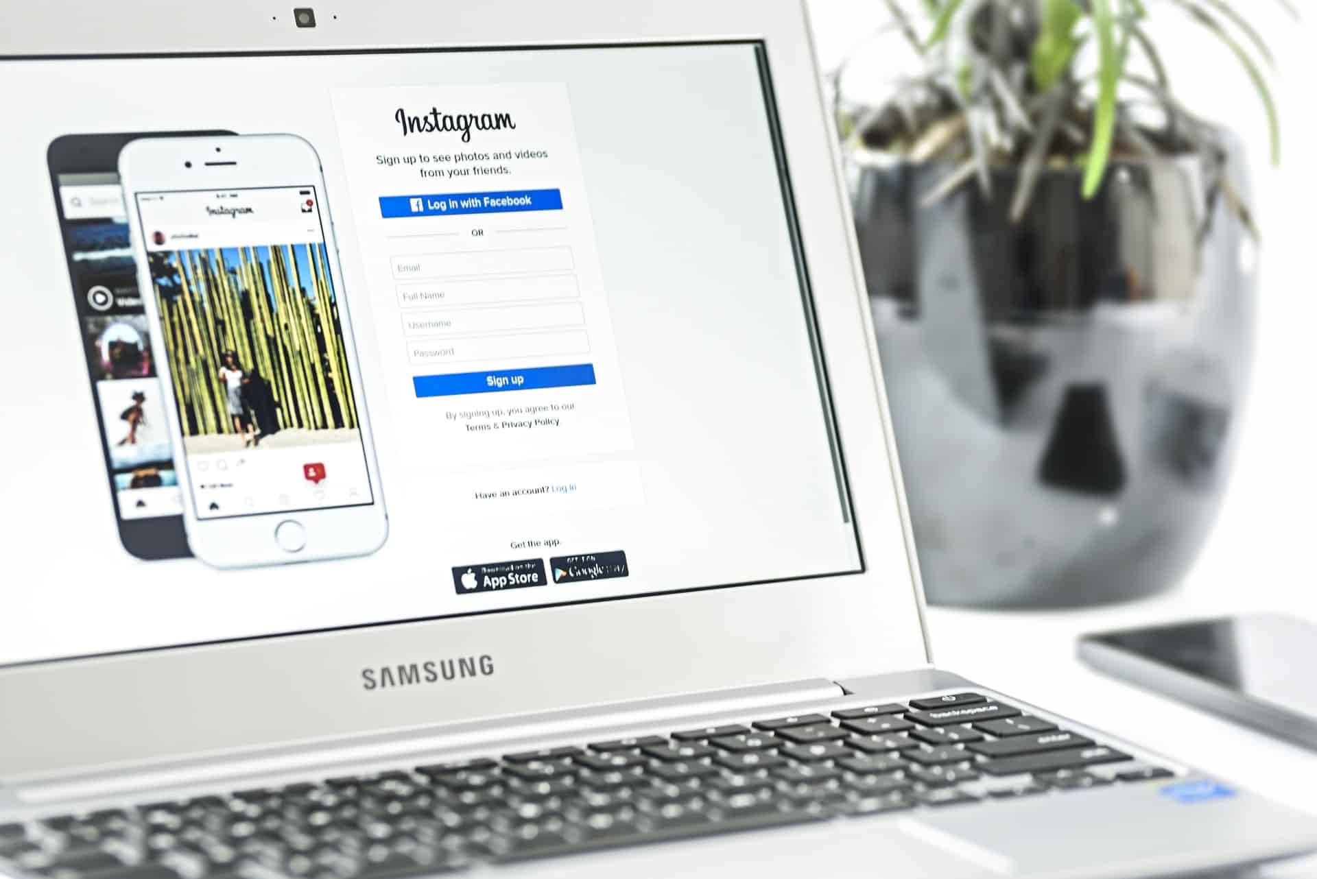
Effective Social Media Link Placement

Effective Social Media Link Placement

Keeping Your Accounts Active

Keeping Your Accounts Active

Keeping Your Accounts Active

Digital marketing success relies heavily on your social media presence, so ensure it stays active and exciting. Posting fresh, relevant content consistently, engaging with followers and using social media tools and best practices are all great ways to build and keep a robust and successful social media presence. Here are some important reminders to keep your social media profiles updated:

  • Develop a content calendar: planning and scheduling your social media content in advance can help ensure that your accounts remain active and engaging.
  • Utilize automation tools: tools like Hootsuite and Buffer can help you to manage and schedule your social media content, freeing up time for other essential tasks.
  • Engage with your followers: regularly responding to comments, messages, and other interactions can help build a stronger relationship with your followers and improve your social media engagement.
  • Continuously evaluate and adjust your strategy: regularly monitoring your social media metrics and adjusting your strategy accordingly can help you continually improve your social media efforts.

Creating Social Media Accounts

Creating Social Media Accounts

Creating Social Media Accounts

The procedure for creating an account, whether for personal or professional use, is quick and easy to follow. Basic information about yourself, a unique username, and account verification are all required. A profile picture, bio, and other personal information may be requested by some social media sites.

Before signing up for a social media account, it’s wise to read the fine print and get acquainted with the platform’s policies. What you put on social media can and will be seen by others, so keep that in mind. When using social media, remember always to act professionally and courteously.
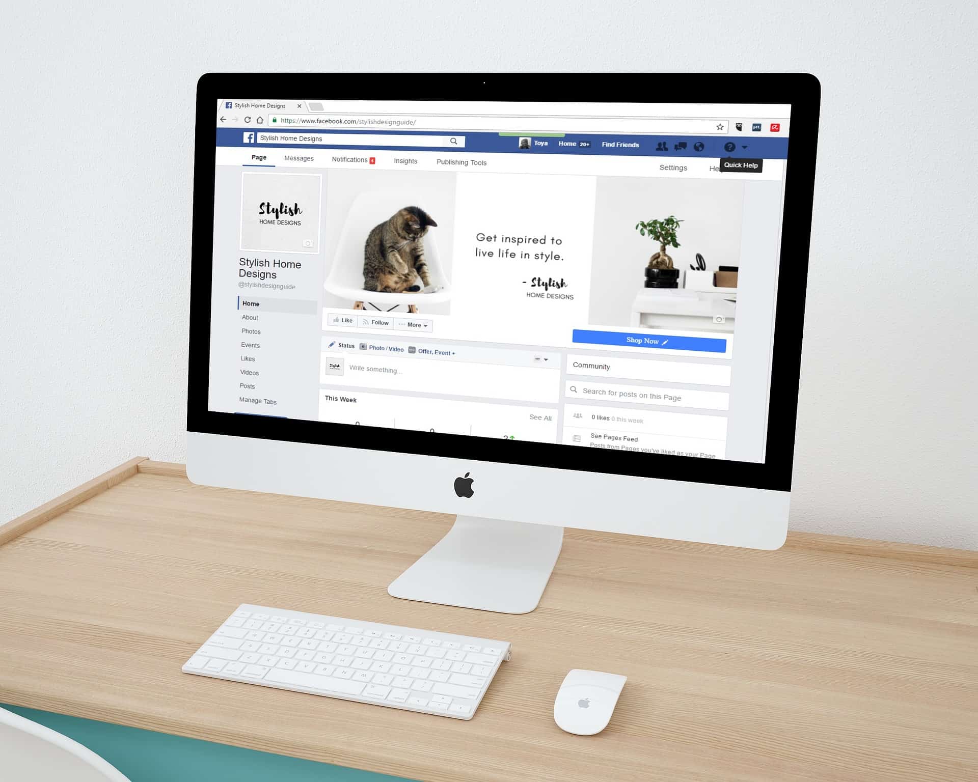
Facebook Account

Create Accounts on Top Social Media Networks

Facebook

Creating a Facebook account is simple and can be done in just a few easy steps:

  1. Go to Facebook’s website: Visit www.facebook.com to start creating your account.
  2. Click on “Create New Account”: This is located on the top right corner of the Facebook homepage.
  3. Fill out your personal information: Enter your first and last name, mobile number or email address, password, and birthday.
  4. Choose your username: Choose a unique username that will be part of your Facebook URL (e.g., facebook.com/yourusername).
  5. Add a profile picture: Upload a profile picture that represents you and is easily recognizable.
  6. Complete your profile: Fill out your About section with your basic information, including your education and work history.
  7. Verify your account: Facebook will send a verification code to your email or mobile number to confirm your account.
  8. Start using Facebook: You can now start using Facebook to connect with friends, join groups, and follow pages that interest you.

Relevant points to keep in mind when creating a Facebook account:

  • Make sure to provide accurate personal information: This will help you keep your account secure and ensure that you can recover it if necessary.
  • Choose a strong password: A strong password helps to keep your account secure and prevent unauthorized access.
  • Complete your profile: A complete profile will help people find and connect with you on Facebook.
  • Verify your account: Verifying your account helps to confirm your identity and keep your account secure.

Twitter Account

Twitter Account

Twitter

Creating a Twitter account is a simple and straightforward process:

  1. Go to Twitter’s website: Visit www.twitter.com to start creating your account.
  2. Click on “Sign up”: This is located on the top right corner of the Twitter homepage.
  3. Fill out your personal information: Enter your full name, email address, and password.
  4. Choose your username: Choose a unique username that will be part of your Twitter URL (e.g., twitter.com/yourusername).
  5. Verify your email: Twitter will send a verification email to the email address you provided. Open the email and click on the verification link to confirm your account.
  6. Personalize your profile: Upload a profile picture and write a bio that represents you and what you’re interested in.
  7. Start using Twitter: You can now start using Twitter to connect with people, share your thoughts, and discover new content.

Relevant points to keep in mind when creating a Twitter account:

  • Make sure to provide accurate personal information: This will help you keep your account secure and ensure that you can recover it if necessary.
  • Choose a unique username: A unique username helps people find and connect with you on Twitter.
  • Verify your email: Verifying your email helps to confirm your identity and keep your account secure.
  • Personalize your profile: A well-personalized profile will help you stand out on Twitter and make a good first impression.
Instagram Account

Instagram Account

Instagram

Creating an Instagram account is easy and can be done in just a few steps:

  1. Download the app: If you haven’t already, download the Instagram app from the App Store or Google Play Store.
  2. Open the app: Once you have the app installed, open it and tap “Sign up.”
  3. Enter your information: Provide your email address or phone number, choose a username and password, and set up your profile.
  4. Add a profile photo: Tap the profile icon in the bottom-right corner of the screen, then tap “Edit Profile” and select or upload a profile photo.
  5. Connect with friends: If you want to find friends on Instagram, you can connect your Facebook account or search for friends using their username or phone number.
  6. Start exploring: Now that your account is set up, you can start exploring and sharing photos, videos, and stories with your followers.

Relevant points to keep in mind when creating an Instagram account:

  • Use a unique username: A unique username makes it easier for people to find and follow you on Instagram.
  • Choose a profile photo that represents you: Your profile photo is one of the first things people will see when they find your account, so make sure it’s a good representation of you.
  • Connect with friends: Connecting with friends is a great way to get started on Instagram and build your following.
  • Be mindful of what you share: Remember that anything you share on Instagram can be seen by others, so be respectful, professional, and considerate of others.
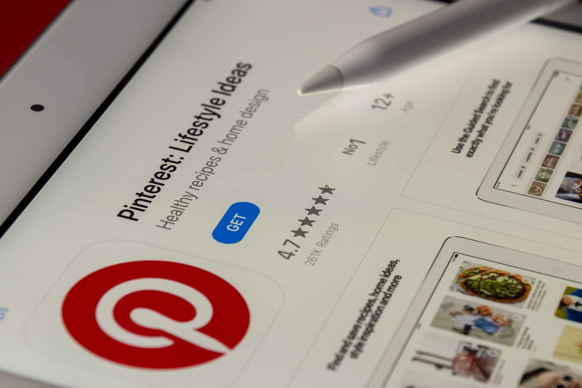
Pinterest Account

Pinterest Account

Pinterest

Creating a Pinterest account is simple and can be done in just a few steps:

  1. Go to Pinterest.com: Visit Pinterest.com and click “Sign up” in the top-right corner.
  2. Enter your information: Provide your email address or phone number, create a password, and click “Sign up.”
  3. Choose your interests: Pinterest will ask you to select topics you’re interested in so it can show you relevant content. Choose as many or as few as you’d like.
  4. Set up your profile: Add a profile photo and a brief description to help others know what you’re about.
  5. Start exploring: Now that your account is set up, you can start exploring and saving pins, boards, and more.

Relevant points to keep in mind when creating a Pinterest account:

  • Choose interests that matter to you: Pinterest will show you content based on the interests you select, so choose wisely.
  • Add a profile photo: A profile photo helps people know that they’re following the right person.
  • Write a profile description: A brief profile description helps people understand what you’re about and what they can expect to see on your boards.
  • Start saving pins: Saving pins is a great way to get started on Pinterest and begin building your boards.
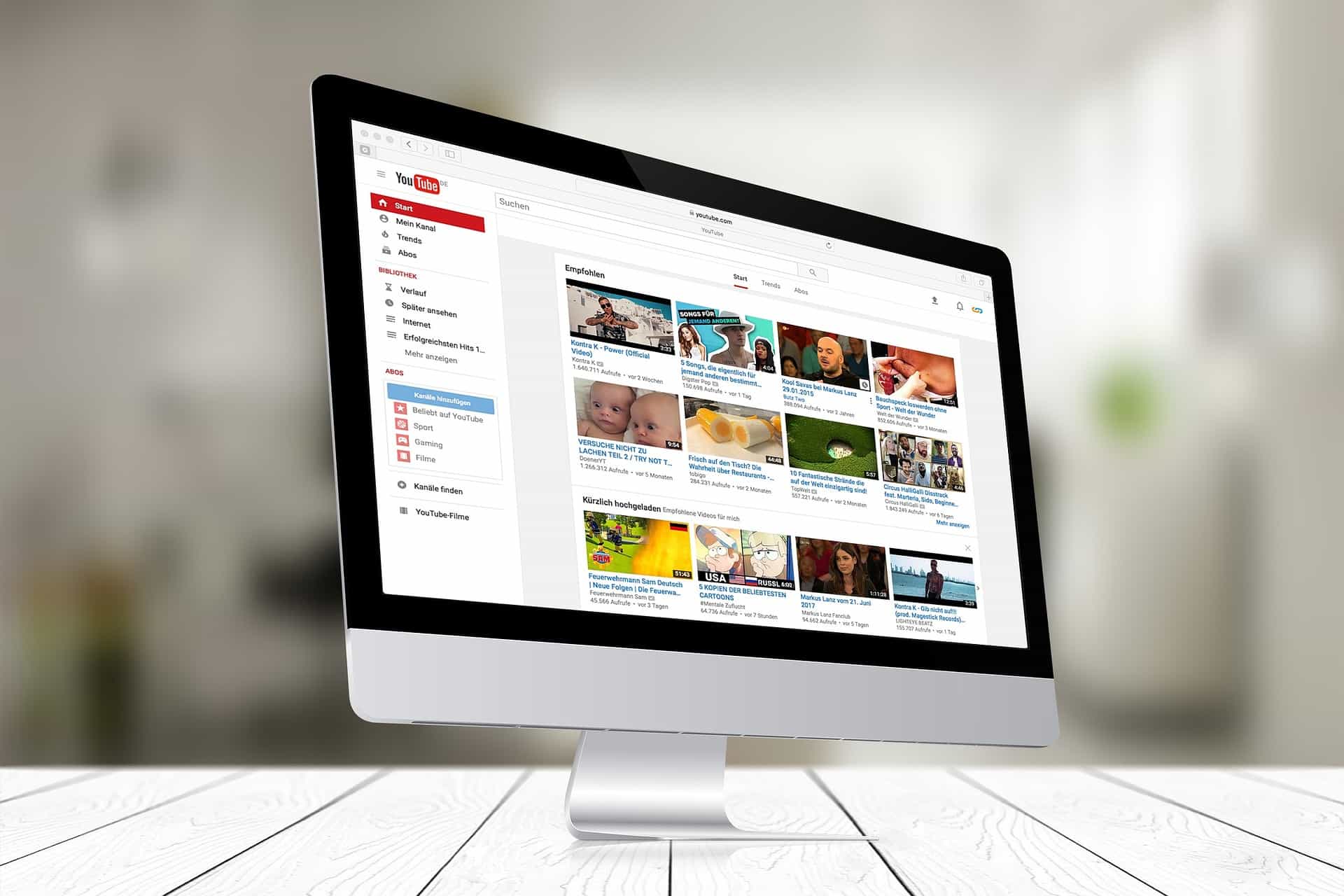
YouTube Account

YouTube Account

YouTube

Creating a YouTube account is easy and can be done in just a few steps:

  1. Go to YouTube.com: Visit YouTube.com and click “Sign in” in the top-right corner.
  2. Sign in with Google: If you have a Google account, you can use it to sign in to YouTube. Click “Sign in with Google” and enter your Google account information.
  3. Create a new account: If you don’t have a Google account, you can create a new YouTube account. Click “Create account” and enter your name, email address, and password.
  4. Add your profile information: Add a profile picture, write a brief description, and set up your channel by choosing a name and customizing your channel settings.
  5. Start watching and uploading videos: Now that your account is set up, you can start watching videos and uploading your own.

Relevant points to keep in mind when creating a YouTube account:

  • Use a Google account: If you have a Google account, you can use it to sign in to YouTube, which makes the process easier and faster.
  • Add a profile picture: A profile picture helps others know that they’re following the right person.
  • Write a profile description: A brief profile description helps others understand what you’re about and what they can expect to see on your channel.
  • Choose a channel name: Choose a channel name that’s easy to remember and reflects the type of content you plan to upload.
  • Customize your channel: Customize your channel’s settings, including the layout, background, and more, to make it your own.

Social Media Strategy Implementation

Create Accounts on Top Social Media Networks

Implement Your Social Media Strategy Now!

Don’t wait another minute; create a successful social media strategy and start engaging users on Facebook, Twitter, and Instagram through your business page and tell the world how great your company is. Using some of the new apps and other tools and having a sound strategy means managing a social media presence doesn’t take a lot of time. So, it is not that hard anymore, and it can be a lot of fun.

Please Note: Depending on your business type, it will be worthwhile to create accounts on additional social media sites, which are either specific to your industry or helpful in promoting your brand. Some of these websites may not be considered social media sites by some “experts.” Still, they may be beneficial for promoting your business, so I have included them in my list of popular social media sites below for your convenience.

  • Facebook
  • Twitter
  • LinkedIn
  • Pinterest
  • Tumblr
  • Dribble
  • TikTok
  • Instagram
  • Flickr
  • Vine
  • MySpace
  • YouTube
  • Discord
  • Tumblr
  • Yelp
  • Vimeo
  • StumbleUpon
  • SoundCloud
  • delicious
  • Reddit
  • Meetup

Disclosure: You may find affiliate links to beneficial resources within this article. You won’t pay more for using our link, but we’ll get a commission. This supports our content creation, and we only suggest products we genuinely believe in. Thank you for being so understanding!

Affiliate Links

James Turner

James Turner

Author/Copywriter

Are you looking for a tech blogger and sales copywriter who can turn your message into a powerful tool for persuasion? Look no further than James Turner, a seasoned professional with over 25 years of experience in the tech industry. With a deep understanding of how to craft words that connect with readers and drive results, James is a master of the art of persuasive writing.

Why Choosing the Best Web Hosting Company Matters in 2025

Find out why choosing the best web hosting company matters in 2025 to boost your site’s performance and skyrocket sales.

Hiring a Website Designer

Hiring a website designer? Discover actionable tips, red flags to avoid, and how to find the right designer to create a website that grows your business.

How to Create a Landing Page Using WordPress

Follow our guide on how to create a landing page using WordPress and the built-in Block Editor, page builder plugins, or specialized themes.

Clean Website Design

Clean Website Design

Clean website design infers a minimalistic, straightforward style with a lot of white space, which has become increasingly popular over the last few years. This is so that the items and services offered can capture visitors’ attention without using extraneous design elements that can distract them. A clutter-free website has simple designs, large text, and graphics.

There are a few guidelines that every competent website designer is aware of, even though there may not be many that are generally accepted. Content is king, to start. Second, quicker-loading websites are typically preferable. Thirdly, there must be obvious calls to action that nudge site users to complete a particular task, such making a purchase, completing a form, or getting in touch with the company.

How a Clean Website Benefits You

Simple websites are good since they load quickly and emphasize obvious calls to action more. This benefits your business by raising the likelihood that visitors will take a certain action that can ultimately result in a conversion and enhance the user experience.

Working With Your Website Designer

Collaborating closely with your website designer is imperative to ensure that your website is tailored to meet your expectations. Ensure the content is divided into the appropriate pages and the pictures and text are arranged logically on each page. This can assist in developing a clear website that makes it simpler for users to locate specific information about your company, goods, or services. Gain valuable insight into the cost-effectiveness of hiring a website designer versus undertaking the task yourself. Make an informed decision on whether to build your website independently or enlist the services of a professional agency.

Working closely with your website designer is essential if you want to make sure that your website is created to fit your expectations. Ensure the content is divided into the appropriate pages and the pictures and text are arranged logically on each page. This can assist in developing a clear website that makes it simpler for users to locate specific information about your company, goods, or services.

Gain valuable insight into the cost-effectiveness of hiring a website designer versus undertaking the task yourself. Discover Why Hiring a Website Designer is Cheaper Than Doing it Yourself and make an informed decision on whether to build your website independently or enlist the services of a professional agency.

“Good design is obvious. Great design is transparent.” – Joe Sparano

This quote underscores the significance of a streamlined and uncluttered website layout. A well-designed website should enable users to seamlessly navigate and interact without conscious awareness of the design’s presence. The design should avoid diverting attention from the website’s content or functionality. A proficient website designer comprehends the delicate equilibrium between aesthetics and usability, crafting a visually captivating and highly functional design.

Designing a Clean and Modern Website for a Client

Designing a Clean and Modern Website for a Client

What is a Clean and Modern Website Design?

“Clean websites” refer to a design style characterized by a minimalistic and uncluttered approach, focusing on simplicity, clarity, and ease of use. These websites often have a streamlined layout with ample white space, crisp typography, and a clear information hierarchy.

The key features of clean websites include:

  1. Minimalism: Clean websites tend to have a minimalist aesthetic, reducing unnecessary elements and distractions. They employ a “less is more” approach, emphasizing essential content and removing excessive visual clutter.
  2. White Space: Clean websites make effective use of white space or negative space, which refers to the empty areas between elements. This space helps create a sense of balance, enhances readability, and directs attention to the important elements on the page.
  3. Simple and Intuitive Navigation: Clean websites typically have a straightforward and easy-to-navigate structure. They often use a simple menu, clear labels, and intuitive icons to guide users through the site’s content.
  4. Crisp Typography: Typography plays a crucial role in clean website design. These websites employ clean and legible fonts with ample spacing between letters and lines. Sans-serif fonts are commonly used for their modern and clean appearance.
  5. Limited Color Palette: Clean websites usually employ a limited color palette, focusing on a few harmonious colors. The chosen colors are often subtle and neutral, enhancing the overall sense of simplicity and cleanliness.
  6. High-Quality Imagery: While clean websites aim for simplicity, they still utilize high-quality imagery to convey their message effectively. Images used in clean designs are usually well-composed, sharp, and relevant to the content.
  7. Consistency and Uniformity: Clean websites maintain consistency in terms of layout, color scheme, typography, and overall style throughout the site. This helps create a cohesive and harmonious user experience.

Why is Clean and Modern Website Design Important?

A clean and modern website design is important for several reasons:

  • It attracts more visitors
  • It enhances the user experience
  • It encourages engagement
  • It boosts conversions

A website’s conversion rate can be increased, first impressions can be strengthened, and users’ time spent on the site can be maximized by adopting a modern, minimalist design aesthetic.

Tips for Clean and Modern Website Design

Here are some tips and best practices for creating a clean and modern website design:

  1. Use a simple color palette
  2. Focus on typography
  3. Use high-quality imagery
  4. Create a clear hierarchy
  5. Utilize white space
  6. Make it mobile-friendly
  7. Use consistent branding
  8. Keep it fast-loading
  9. Make it easy to navigate

A clutter-free, aesthetically pleasing user experience that makes it simple for visitors to access information and engage with the site’s content is the aim of clean website design.

Modern Website Design FAQs

Modern Website Design FAQs

FAQs About Clean and Modern Website Design

We’ve included a collection of frequently asked questions and their respective responses here to assist you in comprehending what clean website design is, why it matters, and how it can help establish your brand.

What distinguishes a clean and modern website from a cluttered one?

A cluttered website features too much content, poor organization, and lacks visual hierarchy, while a clean and modern website design prioritizes simplicity, minimalism, and user-friendliness. There are 17 Reasons Why Your Website Should Have a Clean and Simple Design. A more streamlined and contemporary design will load faster, be easier to use, and look better for your visitors.

How can I make my website mobile-friendly?

Use a mobile-first approach, a grid system, optimized images and videos, and scalable fonts to optimize your website for mobile devices. Using Google’s tools, you may also test your website on different mobile devices.

Mobile-friendly design methods optimize website performance and aesthetics on PCs, tablets, and smartphones. This guarantees that your website functions and appears correctly, making it mobile-friendly. Also, you should optimize your photos for mobile, use large fonts and straightforward navigation, and avoid using pop-ups or other components that may be difficult to utilize on a smaller screen.

What is the importance of white space in website design?

White space, commonly called negative space, is crucial for establishing a sense of balance and visual hierarchy on websites. It gives the items on the page breathing room, making them simpler to read and interpret. Furthermore, white space can make a design feel more elegant and sophisticated and bring attention to crucial items on the page.

How can I improve the loading speed of my website?

You can enhance your website’s loading time by optimizing photos and other media files, employing a content delivery network (CDN), minifying your code, and lowering the amount of HTTP requests. You should also select a reputable hosting company and ensure that your website’s code is optimized for performance.

What is the best way to ensure consistent branding on my website?

Using the same colors, fonts, and graphics throughout your website is the greatest approach to create consistent branding. Make certain that your logo and other branding elements are prominently displayed on each page. Consistent branding contributes to developing a strong brand identity and makes your website more memorable to users.

Why is it important to make my website easy to navigate?

Making your website easy to navigate helps users find what they need quickly. Visitors may grow frustrated and depart if your website is difficult to browse, resulting in a greater bounce rate and lower conversion rates. You can give a better user experience and enhance the possibility that visitors will become customers by making your website easy to navigate.

What is the best way to choose a color palette for my website?

Starting with your brand’s primary colors and building from there is the best way to establish a color palette for your website. Colors that complement each other and produce a harmonious overall design should be used. You may also generate color schemes based on your brand’s basic colors using internet programs such as Adobe Color or Coolors.

What is the importance of a clear hierarchy in website design?

A clear hierarchy in website design is vital because it helps users grasp the material’s structure and traverse the website more simply. Enhance user experience and optimize engagement on your website by implementing strategic headings, subheadings, and visual cues to emphasize the significance and organization of your content.

How can I ensure that my website is accessible to people with disabilities?

The Web Content Accessibility Guidelines (WCAG) (W3C) should be followed if you want to make sure that people with impairments can access your website. This involves making your website keyboard accessible, using descriptive alt text for images, providing subtitles for movies, and ensuring compatibility with screen readers and other assistive devices. You can visit the Accessibility page at WordPress.org to find information specific to WordPress.

How can I best integrate professional-grade photos into my website layout?

Using professional images or graphics related to your business and message is the greatest approach to incorporating high-quality photography into your website design. You should also optimize your photographs for web use by adopting a file type that balances quality and file size, such as JPEG or PNG. Moreover, verify that your photos are properly scaled and compressed to ensure fast download times.

What is the importance of fast-loading times for my website?

Quick loading speeds are critical for your website since they can influence user experience and search engine optimization (SEO). Visitors are more inclined to interact with a website that loads quickly, while slower loading times can result in higher bounce rates and poorer conversion rates. Furthermore, search engines like Google prioritize fast-loading websites in search results, so reducing your website’s loading speeds using the Top 5 Plugins for WordPress Speed Optimization can enhance your SEO rankings and attract more organic visitors to your site.

Modern Website Design FAQs

Modern Website Design FAQs

Final Thoughts on Clean Website Design

The significance of maintaining a clean design for your website in today’s digital landscape cannot be dismissed. It’s like your online business card, delivering that pivotal first impression. Creating clean website designs is one of the 10 Reasons Why You Need to Hire a WordPress Website Designer.

What does a clean website design mean? The utmost importance lies in simplifying, streamlining, and standardizing processes. A website that fulfills its stated goals and allows visitors to get the information they need quickly is a success. This creates a positive user experience, increasing the chances of your visitors sticking around, engaging with your business, and potentially becoming loyal customers.

Clean Website Designs Make a Statement

Additionally, a clean website design says a lot about your brand. You’re sending a message about the personality and offerings of your brand by avoiding a cluttered look. Our platform ensures that your website visitors comprehend your brand identity and the value proposition you provide clearly and straightforwardly. This clarity encourages remembering and cultivates credibility and trust, both essential for long-term economic success.

Minimalist Design

From a technical standpoint, a minimalist design also means faster loading times and compatibility with various devices. With people using everything from smartphones to desktops to access the web, a design that renders well on all platforms is crucial. It is worth noting that a website design that is both simple and clean can facilitate search engines in comprehending and cataloging your website, potentially enhancing your discoverability in search outcomes.

In conclusion, a pristine website layout encompasses more than just aesthetic appeal. It’s also about delivering a smooth user experience, solidifying your brand’s identity, ensuring your website functions optimally across different devices, and making your site search engine friendly. It’s a crucial aspect of your digital strategy that can directly influence your online success.

Disclosure: You may find affiliate links to beneficial resources within this article. You won’t pay more for using our link, but we’ll get a commission. This supports our content creation, and we only suggest products we genuinely believe in. Thank you for being so understanding!

Affiliate Links

James Turner

James Turner

Author/Copywriter

Are you looking for a tech blogger and sales copywriter who can turn your message into a powerful tool for persuasion? Look no further than James Turner, a seasoned professional with over 25 years of experience in the tech industry. With a deep understanding of how to craft words that connect with readers and drive results, James is a master of the art of persuasive writing.

Why Choosing the Best Web Hosting Company Matters in 2025

Find out why choosing the best web hosting company matters in 2025 to boost your site’s performance and skyrocket sales.

Hiring a Website Designer

Hiring a website designer? Discover actionable tips, red flags to avoid, and how to find the right designer to create a website that grows your business.

How to Create a Landing Page Using WordPress

Follow our guide on how to create a landing page using WordPress and the built-in Block Editor, page builder plugins, or specialized themes.

Mobile-Friendly Website Design

Mobile-Friendly Website Design

Why Does My Site Need to be Mobile-Friendly?

Having a mobile-friendly website design is essential because over 60% of people are browsing the internet on mobile devices such as smartphones and tablets. That is an astounding number that will only continue to grow in the years to come, making a responsive website design increasingly important.

Schedule a Free Mobile Website Design Consultation

Your first move should be to schedule a free website design consultation with a company that has experience creating attractive mobile-friendly website designs that engage visitors, while funneling traffic towards a product, service, or action, such as calling you or filling out a form. While you are here, consider contacting James Turner, the writer of this article, for a Free Website Design Consultation.

Woman Shopping on a Smartphone

People Love to Shop Online Using Smartphones

Make Sure Your Site is Ready!

A potential customer is searching the internet for a business in your niche and they are expecting a pleasant user experience. Your website needs to be mobile-friendly because if it is not instead of your business acquiring a new customer that person is most likely going to find a site that is easier to navigate, which means they will be visiting the site of your competition and they will get a new customer.

What you need is a mobile-friendly website that is responsive, which means it will automatically adjust in size to look amazing on any device including desktop computers, laptops, tablets and all brands of smartphones (iPhone, Android).

“Did you know that over 60% of online searches are performed on mobile devices like smartphones?”

Based on Data from 2023

  • Desktop web usage: Around 39% of web traffic was generated by desktops in 2021.
  • Mobile web usage: Around 61% of web traffic was generated by mobile devices.
  • Operating systems: In early 2023, the most popular desktop operating systems were Windows (with around 80% market share) and MacOS (around 10% market share). The most popular mobile operating systems were Android (around 85% market share) and iOS (around 14% market share).
  • Types of devices: The most common types of mobile devices were smartphones (around 95% of the market) and tablets (around 5% of the market).
  • Screen sizes: The most popular screen sizes for smartphones in 2023 were around 6.1 inches (around 40% of the market) and around 6.7 inches (around 20% of the market). The most popular tablet screen sizes were around 10 inches (around 40% of the market) and around 7-8 inches (around 30% of the market).
Online Shopping Using a Smartphone

Online Shopping Using a Smartphone

The Majority of People Searching for Your Business are Using a Smartphone

In 2015 Google stated “more Google searches take place on mobile devices than on computers in 10 countries including the US and Japan.” and many of those people were searching for a local business like yours. You can be sure these numbers are only going to increase over time.

Can you really afford to ignore so many potential new customers? If your website is not a mobile ready design, not only will you lose a customer, your tech-savvy competitors will gain one. Learn more about The Importance of Mobile-Friendly Websites.

Smartphones are Used for Work and Play

Smartphones are Used for Work and Play

Responsive Websites are Mobile-Friendly

Responsive website design is the new standard because this type of design utilizes a mobile-first framework that looks and functions very well on any device. In recent years, many websites used a separate domain to host a mobile version of their site and in fact, some websites still do.

However, this is not recommended for small businesses as it greatly increases costs and reduces your search engine ranking, since your “reputation” is shared by two different domains.

Why Mobile Website Design is Essential

Having a responsive website is crucial in today’s digital age, where people access the internet through a variety of devices such as laptops, smartphones, and tablets. A responsive website is one that adjusts to the screen size and resolution of the device being used to access it. This creates a seamless and optimal viewing experience for the user, which can improve engagement, increase conversions and ultimately drive more traffic to your website.

QUESTIONS

Why is it important for a website to be responsive?

A responsive website provides a better user experience and creates a more seamless browsing experience for your audience. When a website is not responsive, it can be difficult to navigate, causing users to quickly lose interest and leave. This can result in decreased engagement and conversions. Furthermore, Google now considers responsive design as a ranking factor in its search engine algorithms, which means that having a responsive website can also improve your website’s search engine optimization (SEO) and visibility.

What happens if a website is not responsive?

If a website is not responsive, it will not adjust to the device being used to access it. This can result in a poor user experience, with content appearing too small or difficult to navigate on smaller screens. As a result, users may quickly become frustrated and leave your website, leading to decreased engagement and conversions. Additionally, a website that is not responsive may also be penalized by search engines, resulting in lower visibility and search engine rankings.

What does it mean for a website to be responsive?

A responsive website is one that adjusts its layout and content to the screen size and resolution of the device being used to access it. This means that the website will automatically adjust its layout to provide an optimal viewing experience, regardless of whether it’s being accessed on a laptop, tablet, or smartphone. Responsive design helps to create a seamless browsing experience, as users can easily navigate and consume content on any device.

What is the purpose of responsive design in web design?

The purpose of responsive design in web design is to create a seamless and optimal browsing experience for users, regardless of the device they are using to access your website. By using responsive design, you can ensure that your website adjusts to the screen size and resolution of the device being used, providing an improved user experience and better engagement. Additionally, responsive design helps to improve your website’s search engine optimization (SEO) and visibility, which can ultimately drive more traffic to your website.

What are the 3 basic things required for responsive web design?

Responsive web design is a method of designing websites that adapt to the size and shape of different devices and screens. To achieve this, there are three core elements that must be present:

1. Flexible Grid

The first element of a responsive design is a flexible grid. This grid is used to structure the layout of a website, and it should be able to adjust its size to accommodate different screen sizes. This is achieved through the use of CSS media queries and flexible units, such as percentages and ems, instead of fixed pixels. The flexible grid helps to ensure that the content is displayed in a way that is legible and easy to use, regardless of the device being used.

2. Flexible Images

The second element of responsive design is flexible images. Just like the flexible grid, images should also be able to adapt to the size of the screen. This can be accomplished through the use of CSS to set a maximum width for images, or by using the srcset attribute to specify different versions of an image for different screen sizes. By using flexible images, the design is able to maintain its visual impact and balance, even on smaller screens. You should also read our WordPress Image Optimization Guide for Creating Stunning Visuals.

3. Media Queries

The final element of responsive design is media queries. Media queries are used to apply different styles to a website based on the size and shape of the device being used. This means that, for example, you can change the font size, hide or show certain elements, or change the layout of the page depending on the screen size. This is what enables the website to respond to different devices and provides an optimal experience for all users, regardless of the device they are using.

By combining these three elements, designers are able to create websites that are both aesthetically pleasing and functional, regardless of the device or screen size. Responsive design has become an essential aspect of modern web design and has helped to create a more accessible and user-friendly web for all users.

Blogging

Using a Smartphone to Post to Instagram

Mobile-First Website Design Process

Because you plan to blog regularly, you must ensure your blogging space has a fantastic atmosphere. This will differ for each person, so don’t worry if your view differs from the picture above. An office desk with multiple monitors may look just as beautiful if you are a tech geek.

The Art of Crafting Mobile-Friendly Websites

In today’s world, it’s a well-known fact that most internet users access the web on their mobile devices. This means that optimizing a website for mobile use is crucial for reaching and engaging with your target audience. Mobile website design aims to create a user-friendly experience for visitors accessing your site from their phones or tablets.

QUESTIONS

What is mobile-friendly website design?

Creating sites that are suitable for viewing and using on mobile devices is referred to as mobile-friendly website design. The smaller screen size, constrained bandwidth, and touch-based interaction of mobile devices must be taken into account in the design. A seamless user experience that makes it simple for visitors to browse and utilize your website on mobile devices is the aim.

Should I design my website mobile first?

The answer to this question will vary depending on who your target market is and the kind of website you’re building. Designing your website with mobile users in mind makes sense if they visit it predominantly through mobile devices. By doing so, you can ensure that your website is optimized for the devices your target audience uses and that you’re giving them the best user experience possible.

What is mobile-first strategy?

A design strategy known as “mobile-first” puts the mobile experience before the desktop experience. This means that the desktop experience is secondary when developing a website, with the primary goal being on delivering a user-friendly experience for mobile devices. This strategy is predicated on the notion that the majority of internet users access the web through mobile devices and therefore when creating a website, the mobile experience needs to be given the most consideration.

Disadvantages of Mobile-First Design

Although mobile-first design has grown in popularity recently, there are some cons as well. Prioritizing mobile devices involves trade-offs, much like any design strategy. The following are some possible drawbacks to take into account:

Increased Design Complexity

You need to simplify your designs even more than you would for a responsive design if you design for mobile first. This could complicate and lengthen the design process, especially if you have a lot of content to display on a small screen. It can be tough to create the ideal balance between usefulness and simplicity, which is the difficulty.

Limited Screen Space

Working within the limitations of a small screen is part of designing for mobile devices. If you have a lot of stuff you wish to convey, this may result in a cluttered and perplexing user experience. In certain circumstances, it might not be possible to fit everything onto the mobile screen, which might compromise the overall user experience.

Different User Needs and Behaviors

It’s critical to remember that user behavior on mobile devices differs from that on desktops. They respond differently depending on their device and have distinct expectations from each platform. This implies that not every website or application should use a mobile-first design. Before adopting this strategy, take the demands and habits of your target audience into account.

Potential for Slow Loading Times

Compared to desktop computers, mobile devices often have slower connectivity and less computing capacity. This may cause pages to load slowly, particularly if the mobile-first design contains plenty of graphics and multimedia. Performance design optimization is essential since slow-loading pages can negatively affect user experience and even result in site abandonment.

Even while mobile-first design has drawbacks, it can still be a fantastic option for many websites and applications. The secret is to carefully weigh the trade-offs and choose wisely based on the demands of your intended audience.

The Perks of Mobile-First Design

Numerous benefits make the mobile-first design approach a preferred option for web designers and developers. The user experience will be faster and smoother if designers prioritize the mobile experience by ensuring the website is suited for small screens and sluggish connections.

Improved User Experience

A smooth user experience on small screens is the main goal when developing a website with a mobile-first mindset. This results in a better user experience because all the necessary components are easily accessible and usable. A mobile-friendly website is essential for any company trying to connect with its target audience given the continuously growing popularity of mobile devices.

Faster Load Times

Because of the lower screen size of mobile devices, website design must be more efficient. A better user experience and a lower chance of users leaving the site because of poor load times are two benefits of mobile-first websites, which prioritize speed and efficiency.

Increased Search Engine Rankings

Mobile-friendly websites are given priority in the search results of search engines like Google. This indicates that a website designed with mobile users in mind is more likely to appear higher in search results, increasing visibility and traffic. Businesses must prioritize a mobile-friendly experience because more and more consumers are utilizing mobile devices to search the web. If you are interested in ranking better on Google and Bing learn How to Boost Your SEO with WordPress: A Comprehensive Guide.

Lower Development Costs

An increased level of mobile-friendly website design focus is necessary when creating a mobile-first website, which can reduce the overall cost of development. Starting with the mobile experience will help designers avoid the need for time-consuming and expensive extensive redesigns and redo.

What’s the Difference: Mobile-First vs. Responsive Design?

Both responsive design and mobile-first design seek to provide a consistent user experience across all devices, but there are important distinctions between the two strategies. While responsive design scales the layout and content of a desktop website to match different screen sizes, mobile-first design focuses the mobile experience.

Approach

While responsive design begins with a desktop-first approach and adapts the layout for smaller displays, mobile-first design starts with the smallest screen size and grows up from there. With mobile-first design, this variation in strategy may lead to a more simplified and effective mobile experience.

Performance

Speed and performance are prioritized in mobile-first designs, perfect for people on the go withrequires loading slower connections. On smaller screens, responsive design might be sluggish since it frequently necessitates the loading of extraneous pieces and material.

SEO

Search engines like Google favor mobile-friendly websites so a mobile-first design can boost a website’s SEO. Responsive design can still provide a good user experience, but it may not be optimized for mobile search, potentially harming a website’s search engine rankings.

What is the difference between mobile first and responsive design?

Although the terms “mobile first” and “responsive design” are sometimes used synonymously, they refer to two different methods of web design. A website that is responsively designed adapts its layout to fit various screen sizes and devices, as opposed to a website that is mobile first designed particularly for mobile devices. While responsive design tries to give a uniform user experience across all devices, mobile first design concentrates on delivering a condensed, simpler version of a website to mobile visitors.

The priority they place on various design components is where these two approaches diverge most. By putting mobile devices first, mobile first design makes sure that users of these devices have the greatest experience possible. On the other side, responsive design prioritizes the desktop experience before adapting it to smaller devices. The decision between mobile first and responsive design frequently depends on the objectives of a specific website and the intended audience, even if both strategies have advantages and disadvantages.

What happens if the website is not mobile-friendly?

If a website is not responsive to mobile devices, both the website’s owners and its visitors may experience a number of negative effects. A website that isn’t mobile-friendly might be challenging for visitors to navigate and use, which can cause annoyance and a bad user experience. This may cause users to leave the website and never come back, which may have a negative effect on the website’s traffic and conversion rates.

The search engine rankings of website owners may suffer if their site is not mobile-friendly. A non-mobile-friendly website is likely to be hidden on the second or third page of search results due to Google and other search engines’ preference for such pages. Potential clients may find it difficult to find the website as a result, which may have a detrimental effect on the website’s visibility and audience as a whole.

Why are some website designs not mobile friendly?

Several factors can prevent some websites from being mobile-friendly. One typical explanation is that the website was created and built before smartphones and other mobile devices were widely used. Older websites might not be optimized for small displays or touch-based navigation because they weren’t made with mobile devices in mind.

Lack of funds or resources for rebuilding the website to make it mobile friendly is another factor. Some websites may be run by startups or smaller businesses that lack the funds or resources to make a significant makeover.

Some website owners might not grasp the value of having a mobile-friendly website or the actions necessary to make their site mobile-friendly. Regardless of the motivation, it’s critical for site owners to comprehend the necessity of having a mobile-friendly website design in the current digital environment and to take the necessary actions to make their site responsive if it isn’t currently.

Using a Smartphone to Post to Instagram

Using a Smartphone to Post to Instagram

Final Thoughts

Mobile searches are very high but even higher when people are looking for local businesses, meaning up to 80% of people looking for your business are using a smartphone. This makes having a mobile-friendly website design a must, so you must be sure the company creating or redesigning your site uses a mobile-first design process.

Summary

  1. Schedule a Free Consultation
  2. Mobile-Friendly
  3. Mobile First Design
  4. Responsive Website Design

Notice: Updated on 02/05/2023 to provide updated data and more information on mobile-first design, responsive website design, and the differences between the two approaches.

Modern Website Design FAQs

Disclosure: You may find affiliate links to beneficial resources within this article. You won’t pay more for using our link, but we’ll get a commission. This supports our content creation, and we only suggest products we genuinely believe in. Thank you for being so understanding!

Affiliate Links

James Turner

James Turner

Author/Copywriter

Are you looking for a tech blogger and sales copywriter who can turn your message into a powerful tool for persuasion? Look no further than James Turner, a seasoned professional with over 25 years of experience in the tech industry. With a deep understanding of how to craft words that connect with readers and drive results, James is a master of the art of persuasive writing.

Why Choosing the Best Web Hosting Company Matters in 2025

Find out why choosing the best web hosting company matters in 2025 to boost your site’s performance and skyrocket sales.

Hiring a Website Designer

Hiring a website designer? Discover actionable tips, red flags to avoid, and how to find the right designer to create a website that grows your business.

How to Create a Landing Page Using WordPress

Follow our guide on how to create a landing page using WordPress and the built-in Block Editor, page builder plugins, or specialized themes.

My Island Designs

Pin It on Pinterest